Popmenu
Redesigning the Online Ordering Experience
Project: Complete redesign of the current food ordering experience for our restaurant clients that offer online ordering to their guests
Role: Sole Designer
Impact: ~12k+ restaurants
Results: ~+28% conversion
The problem
The old ordering flow had three main issues:
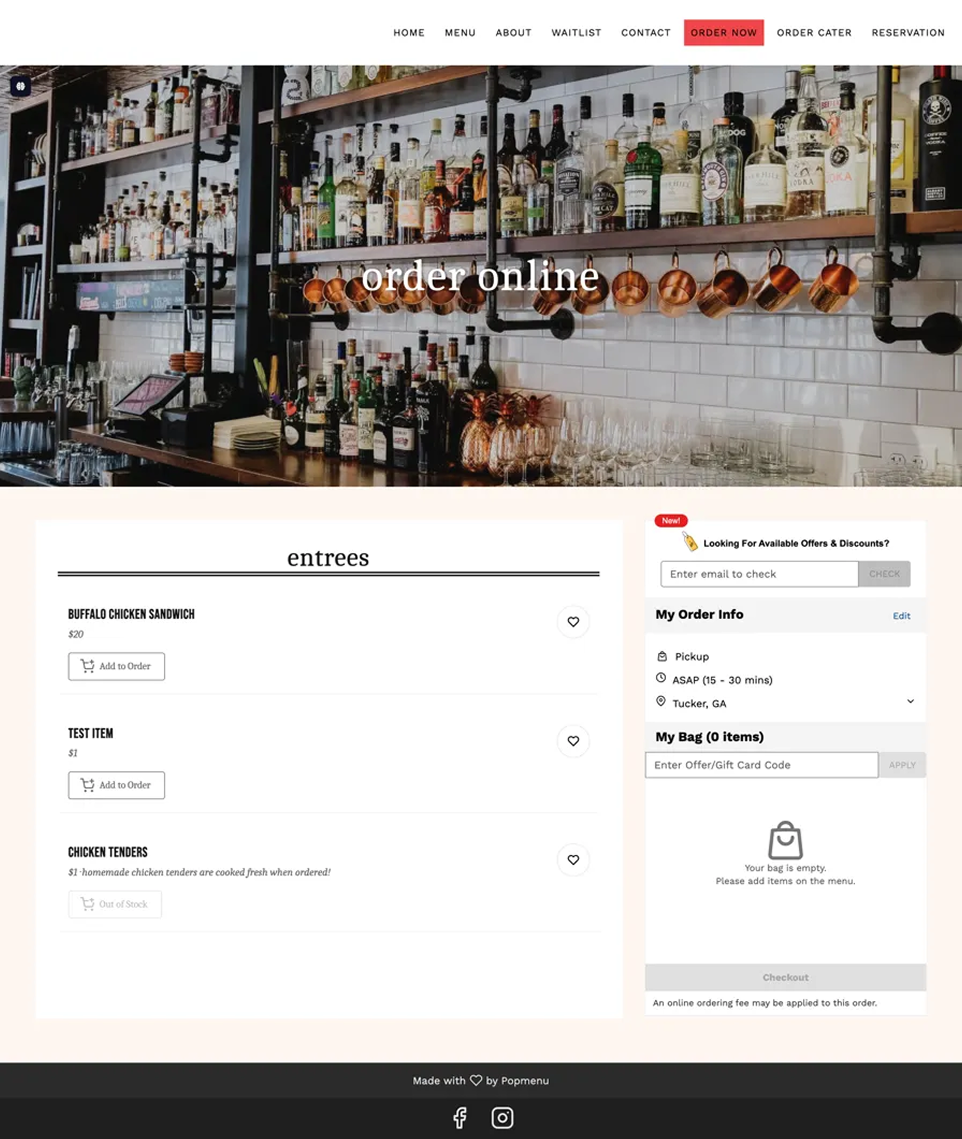
Confusing menus. The regular menu and the online ordering menu looked almost the same. Users often couldn't tell which one they were on, making it hard to know how to actually place an order.
Inconsistent, inaccessible design. The ordering flow lived inside each restaurant's website, so it picked up custom colors, fonts, and styles from every client. This made accessibility unpredictable — something that worked for one restaurant's branding often didn't work well for users on another.
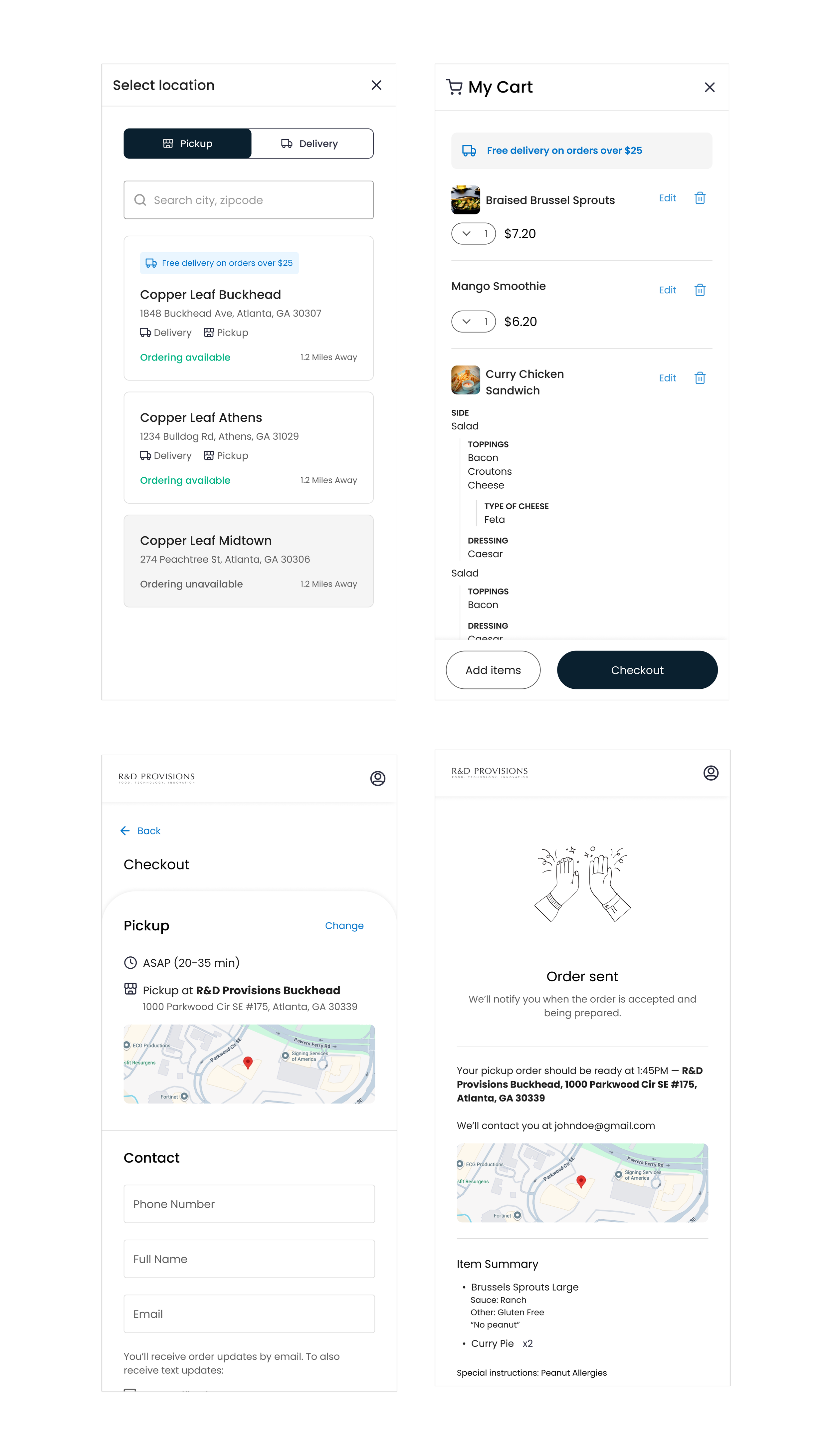
Too many clicks. Placing an order took more steps than it should have.
The approach
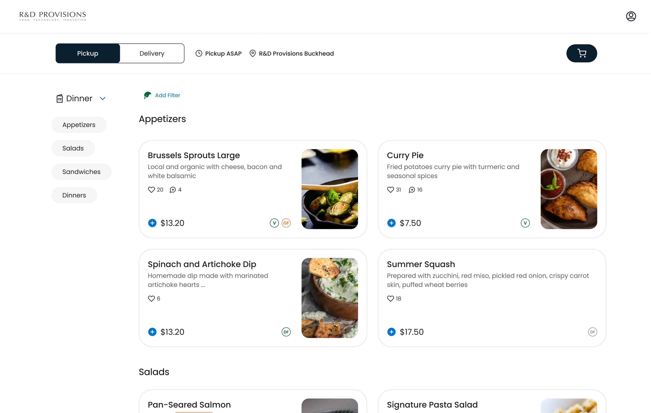
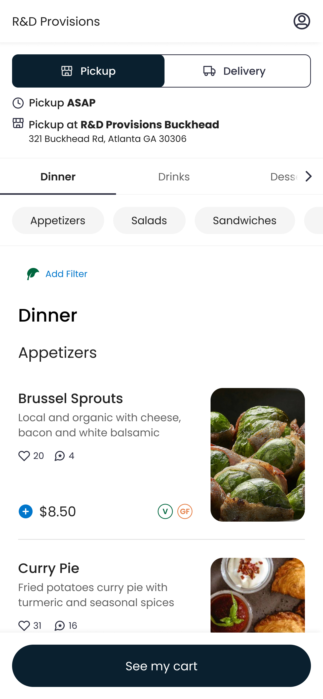
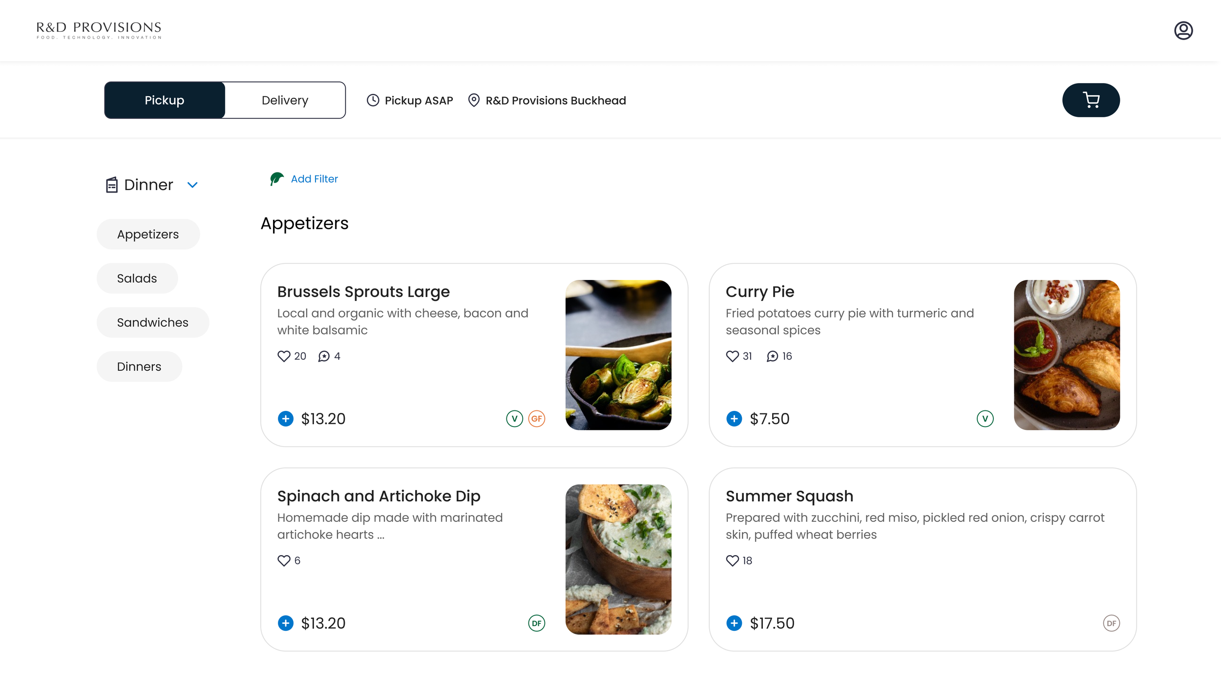
Rather than patch these issues one at a time, the goal was to pull the ordering experience out of each restaurant's custom-branded website and standardize it into its own clean, consistent flow — decoupling it from the visual noise (and accessibility risk) of embedded site styling. This gave every restaurant the same clean, accessible ordering experience, instead of being dependent on custom site styling.
The redesign focused on a simple, minimal-step UI, with clear visual separation between "browsing the menu" and "placing an order," so users always knew which mode they were in.
Result
Rolled out to 12,000+ restaurants, driving a +28% increase in conversion.
Old ordering

New, optimized ordering experience